C1 Advertising


Do Now Tuesday 25th February 2025
1 - 2 exams ✅
2 - 75% 70%
3 - 30% 40%
4 - to entertain , inspire and inform. to make money
What is Advertising?
the main aim of advertising is to bring attention to a product, service or issue.
it might also:
-raise awareness
-inform or educate
-persuade audiences
-create a unique selling point
1 - the main aim of advertising is to bring attention to their product or service, but might also be used to raise awareness and educate on certain issues.
2 - Commercial Advertising is ads that are paid for to make a profit and promote their product, Non Commercial advertising is sponsored by charities or organisations to raise awareness but also make a profit.
Codes and Conventions


Commercial Print Advert
To persuade the viewer to buy as we think it is fresh and clean, conveyed by the text and the way it it made to look like tomato slices.
Non Commercial Print Advert
Do Now Tuesday 4th March 2025
1 - to bring attention to their product ✅
2 - to raise awareness, educate and inform , persuade audiences or provide a unique selling point. ✅
3 - advertising that makes money by promoting consumer goods or services.
4- charities ✅
5 - codes and conventions are things you would expect to see. ✅ expected elements
Codes and Conventions


Commercial
to make the audience believe it is fresh
image of the product , the colour red
soft sell as it trying to come across as fresh and grown.
persuasive language- hyperbole
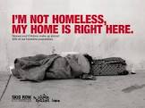
Non commercial
to make people send money and help out with the homeless crisis
image of a homeless person , charity logo , potential slogan
soft sell as it is indicating its about homing crisis.
emotive language to make audience feel empathy

Do Now Tuesday 11th of March 2025
The Levi's advert uses intertextuality because it references Humpty Dumpty which is a nursery rhyme about an egg that falls and cant put himself together again. They have used this reference because they are trying to suggest the jeans are made with strong material for troublemaker kids and can protect even Humpty Dumpty.
Historical Advertisements

logo and slogan - they used persuasive language and an imperative to encourage the audience to buy the drink.
Layout - they used the 'z' layout so your eyes naturally travel to each part
Images - They incorporated a sport - tennis and a man persuading her to have a coke.
Language Codes - they use alliteration of 'delicious drink' which matches with ' coca cola' making for a lyrical read and presenting emphasis on certain parts.
Narrative - the idea of being thirsty after playing sports.
Colour Palette - they use a neutral colour palette for the background - whites, beige and black which highlights the Red of the Coca Cola and the slogan - drawing peoples eyes.
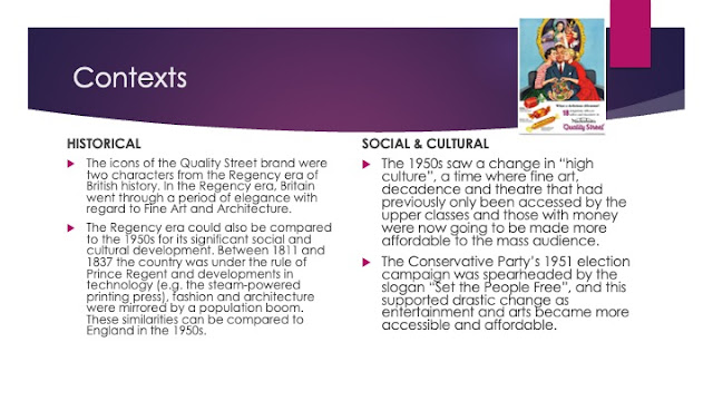
Historical Advert Set Text


Do Now Tuesday 25th March 2025
1 - Mackintosh ✅
2 - Miss Sweetly and Major Quality ✅
3- Regency era ✅
4 - aimed at middle class and poorer people as well as top class ✅
5 - alliteration ✅ and emotive language

design is brightly coloured like the range of sweets and they incorporate the characters - Miss Sweetly and Major Quality.
shows importance of sweets as they are all staring at them - main image is also given the biggest space.
patriotism in the names - sweet for women and quality for man and the success of the man.
all characters are seen as higher class through the suits and ornate paintings.
Persuasive Language Techniques - alliteration and emotive language of delicious dilemma. Repetition of the word 'delicious' to emphasise the flavour and to link the readers ideology of the brand to be positive. Also so it rolls of your tongue - is nice to say out loud.
Images - they connote class and formality to uphold the brand even though it is cheap enough for middle class people.
The characters are higher class by the classy golden picture and clothes they wear ( suit and dresses)
the 'delicious dilemma ' is either between which sweet to pick out of eighteen or which lady to choose. This is emphasised with the way the women are objectified to match the sweets with the colour of their hair and dresses.
Triangular geometric composition. to help secondary anchorage.
anchorage of gold frame with connotations of a halo effect on the man and product.
The Quality Street advert uses the image to uphold the classy brand ideology, Their clothing ( suits and formal dresses) indicate the characters are upper class and are wealthy - making them aspirational for working middle class families. The intricate design and gold of the picture frame give connotations of a ' halo effect' which makes the man and sweets seem important. All of the characters are focused on the sweets also giving it a regal light.
Do Now Tuesday 1st April 2025
1 - what is being presented in a diverse manner how it is portrayed in media texts
2 - 1950s
3 - inferior , liking to clean and cook and not have fun ✅ sexualised , objectified - housewives
4 - they were aimed at working middle class also as well as the rich✅
5 - delicious
Do Now Tuesday 29th April 2025
1 - connotation is items that you link to a meaning something suggested by a word or image.
2 - blood, passion, love, anger, emotion, violence, strength ✅
3 - friendly, best friend, loyal, companion, scary, danger, protection ✅
4- the depiction of women to objectify them and satisfy men. from a male perspective
5 - symbol or word to represent a brand. ✅
Analysing Modern Adverts
Positive
inquisitive
interested
curious
disabled
handicapped
Negative
nosy
crippled
retarded
LOGO's
a - adobe ✅
b- barbie ✅
c - cocoa cola
d - disney ✅
e - ebay explorer
f - facebook ✅
g - google ✅
h - hyundai honda
I - ibn
J- JBC
k - kellog ✅
l - lego ✅
m - mcdonalds ✅
n - nintendo ✅
o - oreos ✅
p - pinterest ✅
q - quicktime
r - reese's ✅s -
t - twitter
u - unicef
v - virgin holidays ✅
w - waterstones ✅
x -xbox ✅
y- yahoo ✅
z- amazon✅
Persuasion in Adverts
rhetorical question - are you even listening?
repetition - falling, falling, falling
alliteration - slithery snakes
emotive language - heavenly , choking , terrifying , betrayal
opinion as fact - everyone is beautiful in their own way - an opinion stated as a fact.
celebrity endorsement- Nike using Micheal Jordan
hyperbole - Im so hungry i could eat a horse
facts and statistics - the Earth is round - 49.71% of the world is female
direct address - you need to clean your room
imperatives - do your work right now!
open a coke. open happiness. - repetition , imperative
find your place. -
losing weight, saving money, performing better. - triplet , opinion as fact
the best four by four by far - alliteration
this ad may change your life - hyperbole , emotive language , opinion as fact.
Do Now Tuesday 6th May 2025
1 -hyperbole, alliteration, repetition ✅
2 - imperative ✅
3 - alliteration ✅
4 - direct address ✅
5 - emotive language ✅
Women in Advertising

'hot and not bothered'
challenges the stereotypes that women have to wear full makeup and not break a sweat even at the gym. It encourages women that they are attractive even when sweaty and hot, and shouldn't be fearful of judgement.

The use of the colour palette - blue and yellow - coordinates with the drink. The neon yellow connotes energy and grabs the viewers attention.
The image of Gareth Bale - a popular footballer connects the brand to sports and athleticism and shows the audience that they can perform like him with the Lucozade.
The text uses a hyperbole to exaggerate the effects of the drink and to persuade the viewers. They also use the hashtag to believe to encourage the audience of how well they can do athletically. also uses direct address to target their audience and persuade them.
opinion as fact .
uses the hashtag on social media to promote other products.

positive representation of women - repetition of 'good' to encourage women of their ability.
blue and pink to challenge gender representation of colour. highlighting better for it in pink to show women can be
Do Now Monday 13th May 2025
1 - this girl can. ✅
2 - to break stereotypes of women in sport and motivate them to start working out. ✅
3- 12th January 2015 2016
4 - fear of judgement - stereotypes of women in sport.✅


1 - they are playing sport ( sprinting, climbing ropes, getting ready to run)
2 - they are wearing sports gear - showing their physique through clothes that promote confidence and strength.
3 - all have their hair up / no makeup or natural looking makeup - no sexualisation or focus on makeup as it is not the intended purpose.
4 - colour palette of neon colours like pink, green and blue - to pull your focus to the women
5 - positive use of words like 'good' and 'better' to encourage girls that they can do it. The word choice of crown connotes power and royalty.
6 - showing that they could be all labels side by side - popular but also athletic and strong in their femininity
In the Nike and Adidas posters, women were represented as sporty and confident. Which was suggested by the use of sportswear that did not sexualise women but promoted a healthy relationship with their body by the exposure of skin.They also decided to portray them as wearing their hair up and having no/natural makeup as an anti stereotypical way to show women to be confident and not have to glam up just to go to the gym. They use Jessica Ennis - a well known athlete to encourage women to join her in working out.
However in the this girl can advert women are represented humane and realistic with the use of the baggy clothing indicating that these women do not fear being judged. They also are portrayed to be sweating with messy hair to show that this is natural to sweat as it shows you have worked hard. They use a woman who isn't a celebrity to make the viewers feel down to earth and able to work as hard as others who aren't professional.
Do Now Tuesday 20th May 2025
1 -sly, sneaky, athletic ✅ stealthy, beautiful , female
2 - a lexis is the specific language used. ✅ word choice
3 - how the font looks - colour/ style ✅
4 - to make people search it up or use it ✅ to encourage social media interaction.
5 - mid shot ✅
Representation
Dominant Ideology - The attitudes, beliefs, values and morals shared by the majority of the people in a given society.
1 - her facial expression creates a positive feeling about sport as it shows women they don't have to look perfect when working out and that it is normal to have messy hair or be sweating. She looks like she doesn't care what others think and is enjoying herself which links this to the message.
2 - It encourages women that anyone can work out - regardless of fitness or age as the women used isn't a stereotypical model - no makeup , baggy mismatched clothes and messy hair.
3 - The title includes all women and is inclusive, to motivate any women no matter their difference to exercise and feel self confidence.
PROPP


How have women been represented in the ' this girl can' ( 2016 ) print advertisement?
In the ' this girl can' print advertisment women are represented as humane and realistic through the portrayal of the women on the cover, who is not a stereotypical model. The magazine is intended to encourage more women to work out and feel confident in their bodies - through the use of the woman's baggy mismatched clothing, the sweat and her messy hair. This shows women that they don't have to be all glammed up for the gym as their purpose isn't just to look pretty. This magazine doesnt fit in with the ' male gaze' theory.
Comments
Post a Comment