Coursework
Do Now Tuesday 10th of June 2025
1 - NEA is non examined assessment
2 - no you cant work in groups. ✅
3 - you cant use found images. ✅
4 - 30 % ✅
5 - conventional magazines. ✅ codes and conventions
Research task 1

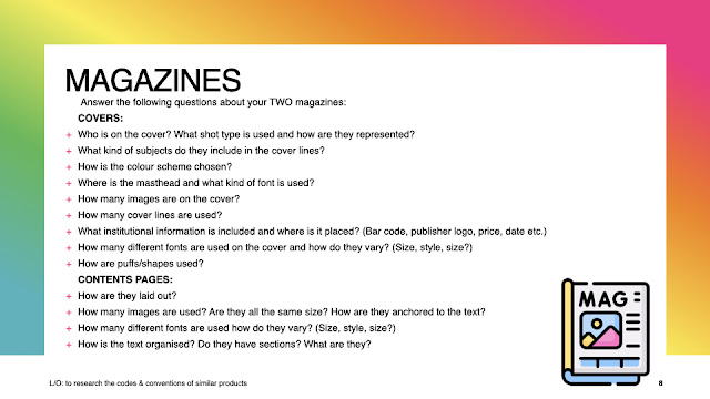


Rolling Stones - Lana Del Ray
1 - Lana del ray is on the cover - a medium cover shot is used. She is represented as mysterious and hot through her wearing a swimsuit and the pose.
2 - The cover lines talks about a variety of music artists - from rapper, Azealia Banks to Lady Gaga who is a mix of pop and rap.
3 - The colour scheme is black and whites and grey with the pop of red intended to highlight and show importance to certain points of the magazine - like the magazine brand and world tour. It also brings the feeling of classiness and mystery.
4 - The masthead is the magazine brand of rolling stones in condensed slab serif influenced by 19th century brand design. It uses italics with its tails and cursive lettering.
5 - 1 image is on the cover as is normal in magazine conventions.
6 - 5 cover lines
7 - barcode along the side ,
8 -
9 - 1 puff used to highlight the Lady Gaga tour.
Do Now Tuesday 17th June 2025
1 - magazine
2 - 16 - 24
3 - rock, pop

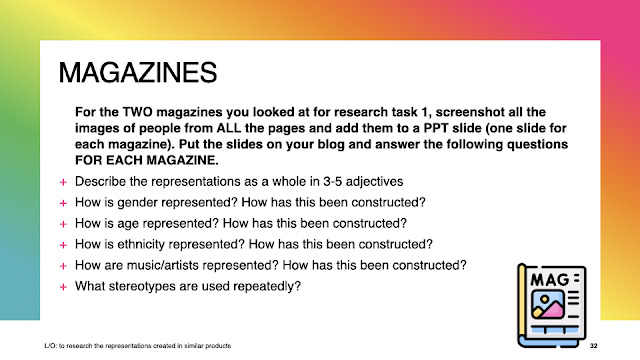
1 - Lana Del Ray is on the cover - using a mid long shot. She is represented as feminine through the inclusion of pink and her pose- but also mysterious from her serious facial expression.
2 - the cover lines are on music referencing Maisie Peters - who is a pop singer.
3- colour scheme is pink, grey and dark brown - which pairs the gentle feminity of pink with the classiness of darker colours like black.

2 - they used 4 images with three smaller ones down the side and a bigger one on the right - so the bigger one is the focal point and the others indicating a photo booth cool vibe.
3 - they use 2 fonts - thinner serif for the title and then flowy italic for the majority of the text.
4 - the text is organised with no subheadings and little chunks of writing.
5 - colour scheme is black and grey to indicate a cool chic mood and highlight tonal shadows
6 - representation of women to show they are hot and powerful
7 - no stereotypes
Article
1 - genre conventions - dark colours, pop of bright colour , close up
2 -
15th Tuesday 2025 July
for my music subgenre of pop -
imagery - picture of a music star or famous person - either close up or showing a cool outfit or pose.
colour palette - bright colours or normally a lot of one colour ( eg : pink )
typography - either twirly and feminine looking or big and bubble text
lexis - using popular music artists, gossip and fashion.
representation - stereotypically looks like the music genre ( light colours and dresses for pop and grunge makeup and clothing for rock.
topics - fashion , why musicians wanted to become, love

gender is represented as independent, confident as she isn't shy in her pose - slightly sexy as we can see her bare back. Its not intended to be sexual as the close up isn't aimed for her body.
age has been represented in being young adult as being carefree, fun and confident as we see her posing boldly for the camera and showing off her beauty.
her music is represented as being sexy and alternative as she put the magazine in black and white connoting mystery and beauty.

representation - beautiful, feminine , confident , stylish
her music is given the connotation of beauty and obvious femininity with the pink top and pink title. The jewellery with the hoops and necklace shows she is feminine and she is wearing darker makeup to contrast to her femininity and show the mysterious chic side of her music.
the pose indicates her femininity and chic nature also as she is playing with her hair and giving direct address of eye contact to the camera indicating confidence in herself and her appearance.

1 - Non Examined Assessment
2 - cannot work in groups.
Do Now Tuesday 16th September 2025
1 - 16 - 24 ✅
2 - a music magazine ✅
3 -
4 -
5 -

Contents pages

1 - it is displayed by the image in the left corner and the different page numbers around and on top of the image.
2 - 1 image in the corner probably of a famous artist which correlates to the words.
3 - probably one font used - big and blocky in plain black to contrast with the white of the background. The description is in smaller letters and in grey to indicate that the subtitles are more important then the description.
4 - the text is organised in sections for different contents like intros and sequences as they are intended to inform or be enjoyed differently.
Do Now Thursday 18th September 2025
1 - Non Examined assessment ✅
2 - no you cant work in groups ✅
3 - no only logos and barcodes
4 - 30% ✅
5 - real music magazines codes and conventions


LO - to plan an effective product aimed at a specific audience using the codes and conventions.
Do Now Thursday 25th September 2025
1 - A footballer ✅
2 - surviving a bullet to the head. ✅
3 - gentleman's quarterly✅
4 - fashion ✅
5 - the title ✅
Do Now Tuesday 30th September 2025
1 - she isnt a model, white, particularly thin or famous ✅
2 - fashion interested, abc1 ✅ alpha males, intelligent
3 - ABC1 females, educated, wealthy ✅
4 - the use of words to give meaning to images, such as captions, headlines, and taglines.
5 - main cover line = the largest cover line linking to the main image that explains the main feature.
Do Now Thursday 2nd October 2025
1 - 16 - 24 ✅
2 - a music magazine cover, contents and article page. ✅
3 - the colour scheme, the image and the artists ✅
4 -
Do Now Tuesday 14th October 2025
1 - a masthead, main coverlines, lexis ( mes en scene - clothes, props)
2 - representation of women liking rock music - it is open to all.
3 - I will use a girl on the front cover and explain that rock is for all
4 - red black and white - the red pops out as the main colour and all are symbolic of anger which is inherent.
5 - the colours, topics and images used. used a younger artist on the cover to emulate the interest of the teen/ young adult audience.
Do Now Thursday 16th October 2025
1 - a ✅
2 - sweating like a pig, feeling like a fox
3 - ideology is beliefs, attitudes and values
4 - intertextuality referencing of one text to another
5 - 12 - NTTD age rating
Comments
Post a Comment